beau & eve
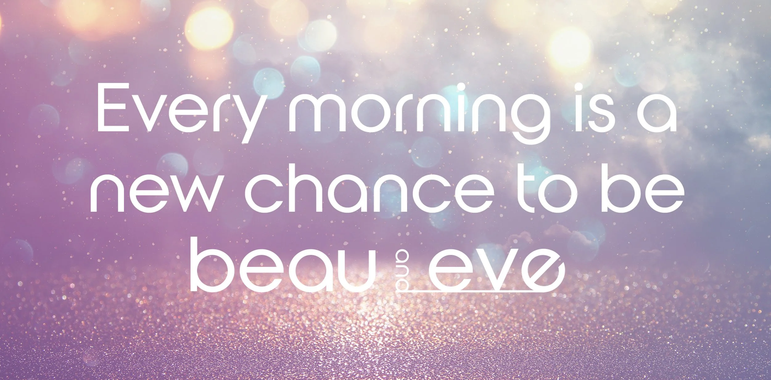
Your Daily 'Refresh'—The Heart-Fluttering Start to a New You
The Origin:
A New Definition of the Name
'beau & eve' designs the moment of 'Beginning', where you awaken as a better version of yourself than yesterday.
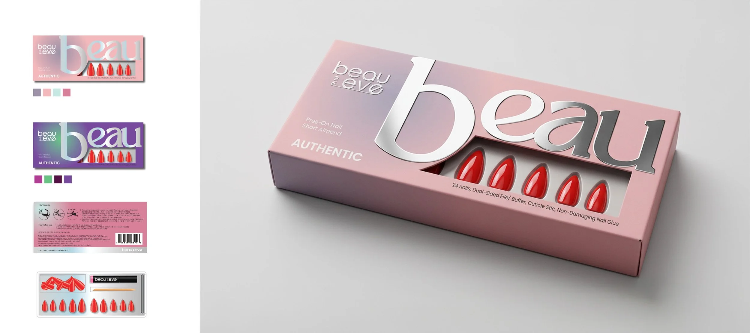
beau (Reset / Fresh Start): Represents the 'reset' time—grooming the nails, the foundation of self-care, to empty out daily stress and start anew with a clean slate.
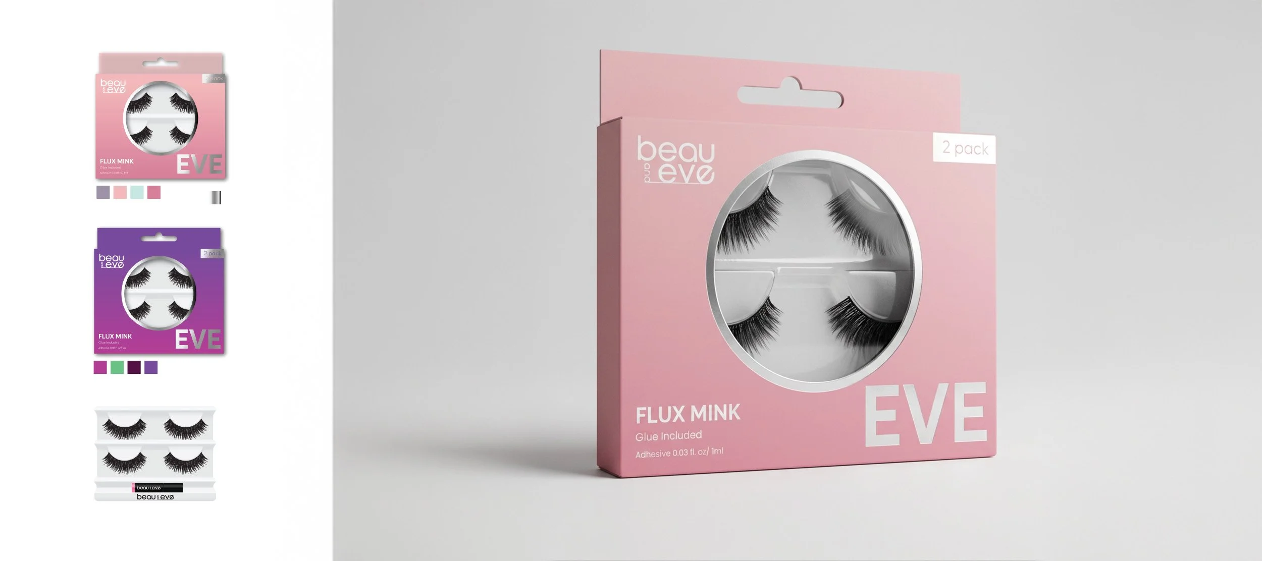
eve (New Look / Trend): Symbolizes a confident 'departure' into the world by wearing a fresh expression and mood through the eyebrows—the focal point of the face.
We believe that the moment you meet your most polished self, a new daily life begins.
Visual Logic:
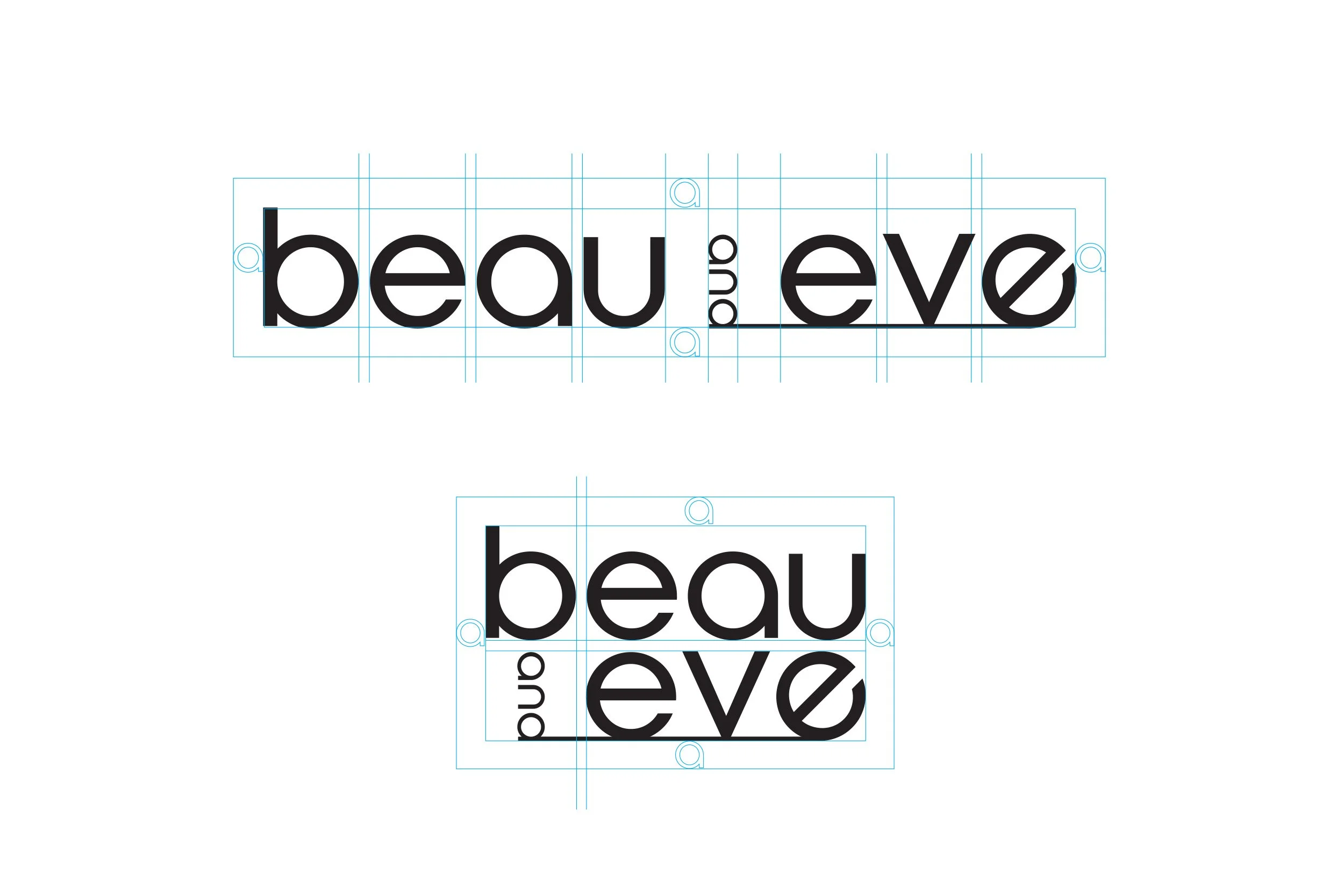
The Horizon of Growth
The horizontal line at the bottom of the logo is not a mere decoration; it signifies the 'Horizon' announcing a brand-new start.
The Horizon: Starting from the 'and,' this line visualizes the transformative process of building a solid foundation (beau) and moving toward a new style (eve), capturing the value of growth that the brand pursues.
The 4 Stages:
Four Moods to Cheer Your New Beginning
Every day starts differently. We’ve designed four distinct packaging systems tailored to the purpose of your day.
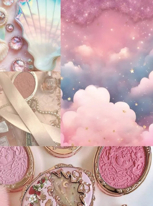
GIRLY (Fresh Start): A pastel palette filled with fresh and youthful energy, like dreaming a new dream.
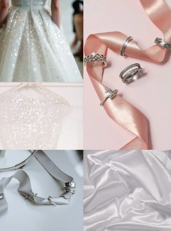
WEDDING DRESS (The First Step): The cleanest, most radiant white tones to celebrate the trembling first steps of life’s greatest beginning.
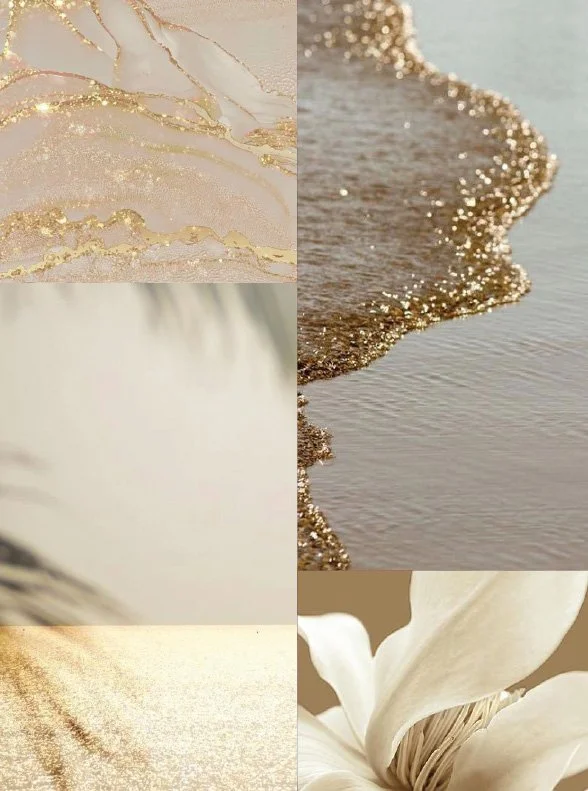
GOLD LUXURY (New Success): A harmony of deep colors and gold, adding dignity and confidence for those standing on the verge of a new leap forward.
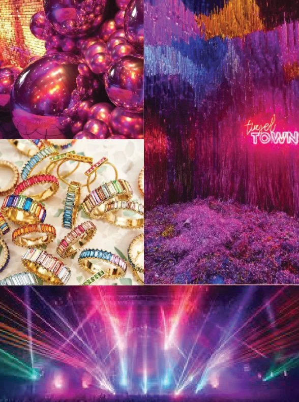
FANTASTIC (New Adventure): Bold glitters and colors that awaken a completely different side of you on days when you need a creative escape.
Designer’s Note
Everyone has that moment of centering themselves while looking in the mirror. Through beau & eve, I wanted that fleeting moment to be more than just grooming—I wanted it to be a 'ritual' for starting the day anew. Although this project was never officially launched, the 'excitement of a new start' embedded within it represents my most sincere approach to branding.